Discourse & Satsangs
Global Satsangs
START: JANUARY 1, 2022
08:00PM IST
END: DECEMBER 31, 2022
09:15PM IST

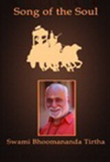
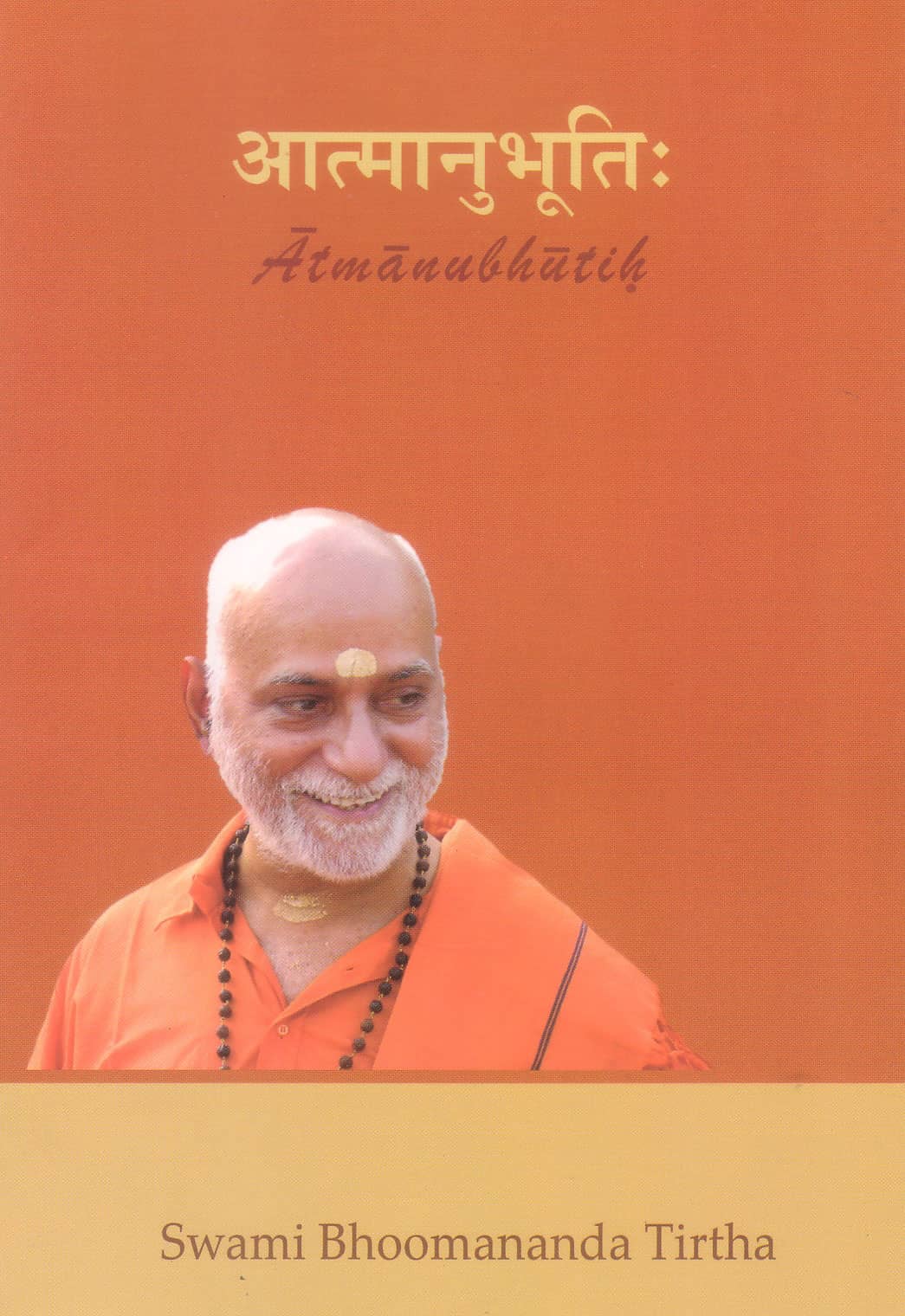
Swami Bhoomananda Tirtha
Poojya Swamiji's Global Satsang Video Playlist - Bhagavad Gita

Swami Nirviseshananda Tirtha
Nutan Swamiji's Global Satsang Video Playlist - Voice of Upanishads
Weekly online Satsangs in English by Poojya Swamiji, Nutan Swamiji and Ma, focusing on practical relevance of spiritual pursuit and scriptures to daily life.
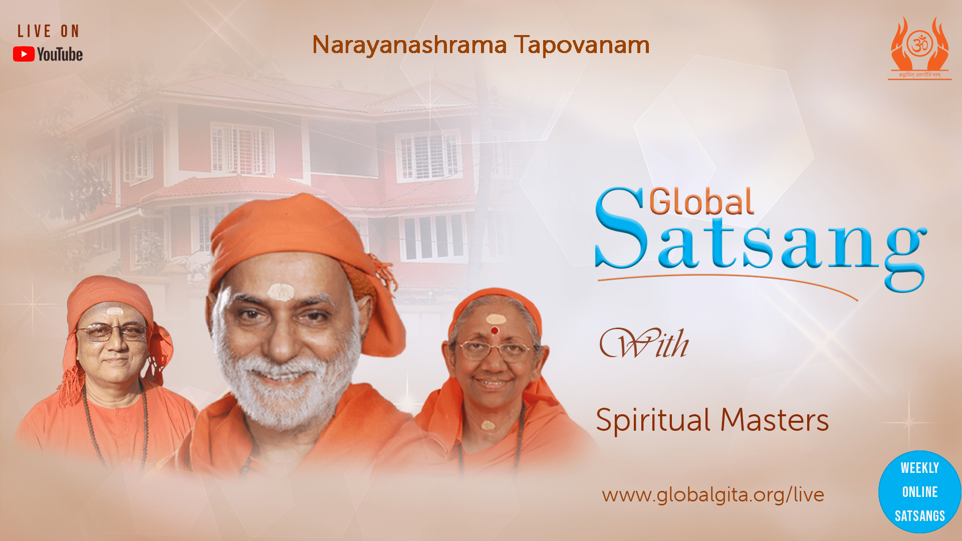
Satsangs by Swami Bhoomananda Tirtha Ji based on Bhagavad Gita
Every Saturday at 8 PM IST (India) / 09:30 AM EST (USA) / 10:30 PM MST (Malaysia)
—-
Satsangs by Swami Nirviseshananda Tirtha Ji on ‘Voice of Upanishads’
Every Tuesday at 8 PM IST (India) / 09:30 AM EST (USA) / 10:30 PM MST (Malaysia)
—-
Satsangs by Swamini Ma Gurupriya Ji on ‘Towards Eternal Peace and Happiness’
Every Thursday at 8 PM IST (India) / 09:30 AM EST (USA) / 10:30 PM MST (Malaysia)
Our Spiritual Masters
-
 Swami Bhoomananda Tirtha
 -
 Swami Niviseshananda Tirtha
 -
 Swamini Ma Gurupriya
EVENT SCHEDULE AND HIGHLIGHTS
08:00PM - 09:15PM IST
Towards Eternal Peace and Happiness | Swamini Ma Gurupriya
Based on Bhagavad Gita, Vivekachudamani, Yoga Vasistha Ramayanam and Bhagavatam
08:00PM - 09:15PM IST
Bhagavad Gita | Swami Bhoomananda Tirtha
Based on Bhagavad Gita
08:00PM - 09:15PM IST
Voice of Upanishads | Swami Nirviseshananda Tirtha
Based on Mundakopanishad
08:00PM - 09:15PM IST
Towards Eternal Peace and Happiness | Swamini Ma Gurupriya
Based on Bhagavad Gita, Vivekachudamani, Yoga Vasistha Ramayanam and Bhagavatam
08:00PM - 09:15PM IST
Bhagavad Gita | Swami Bhoomananda Tirtha
Based on Bhagavad Gita
08:00PM - 09:15PM IST
Voice of Upanishads | Swami Nirviseshananda Tirtha
Based on Mundakopanishad


