Ma's Global Satsang Video Playlist—Towards Eternal Peace and Happiness
SCRIPTURES
- Aparokshanubhuti Ashtavakra Samhita Bhagavad Gita Bhaja Govindam Brihadaranyaka Upanishad Guru Ashtakam Guru Gita Isa Upanishad Katha Upanishad Kenopanishad Lingashtakam Madhurashtakam Mahabharata Mundakopanishad Sarva Vedanta Siddhanta Sara Sangrahah Saundarya Lahari Shanti Mantras Shvetashvatara Upanishad Srimad Bhagavatam Subhashitam Taittiriya Upanishad Upadesha Panchakam Vairagya Shatakam Vishnusahasranama Vivekachudamani Yogavasishtha Ramayanam
PLAYLISTS
- Ashtothara Shatanamavali Atma Sudha (Fountain of Bliss) Atma Sudha Verse by Verse (Fountain of Bliss) Bhagavad Gita Bhagavad Gita - Listen and Learn Bhagavad Gita - Verse by Verse Bhagavad Gita Chapter 15 Bhajans Essential Shlokas For Memorization (Bhagavad Gita) Evening Prayers Inner Embrace Inner Embrace Verse by Verse Morning Prayers Song of the Soul Song of the Soul - Verse by Verse Verses for Introspection Vishnusahasranama
PLAYLISTS
- Bhagavadgeeta – A Revolutionary Message Bhagavadgeeta – Sattva-Rajas-Tamas & Their Transcendence Ch.14 Prabhata Rashmih - Malayalam Prabhata Rashmih Prabhata Rashmih - Austerity and Renunciation Prabhata Rashmih - Brahmavidya Prabhata Rashmih - Discover Spirituality Prabhata Rashmih - How to Lead Life towards Fulfillment Prabhata Rashmih - Introspection, the knowledge austerity Prabhata Rashmih - Meditation - The Purpose and the Process Prabhata Rashmih - Mind - Its Mysteries and how to Spiritualize it Prabhata Rashmih - Nurturing Good Qualities Prabhata Rashmih - The Eternal Relevance of Scriptures Prabhata Rashmih - The Nature of Consciousness Prabhata Rashmih - The Practice of Sadhana Prabhata Rashmih - The Relationship with God Prabhata Rashmih - The Role of a Guru Prabhata Rashmih - What is it to be spiritual and its benefits Prabhata Rashmih - Where lies True Dharma Prabhata Rashmih – Interactional Sadhana, its role and means Prabhata Rashmih – Making Devotion Wholesome Prabhata Rashmih – The Unique Philosophy of the Bhagavad Gita Realise the Self - Here and Now The Majesty of the Mind Zenith of Devotion
TYPE
SPEAKERS
PROGRAMS
LOCATION
YEAR
CONTENTS TYPE
LANGUAGES
DURATION
Filter

VIDEOS (148)
Ma Gurupriya
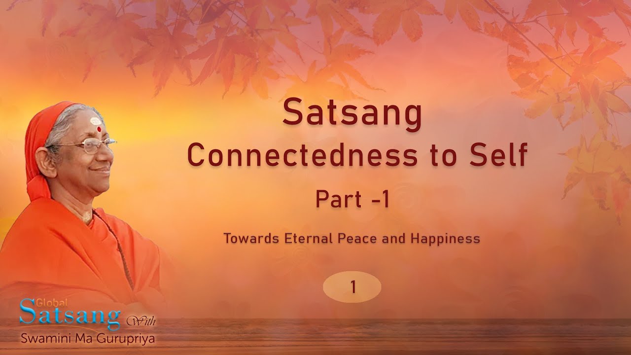
001 – by Swamini Ma Gurupriya – Satsang – Connectedness to Self – Part 1
This is the 1st video in the playlist containing the ongoing weekly online Global Satsang series by Swamini Ma Gurupriya ji. In this talk, Ma elaborates on how satsang helps to remain connected with the self through verses from Vivekachudamani, Srimad Bhagavatam and other spiritual texts.


